Uncle Tibo
A new coffee house and pizzeria opening on Kirkdale in Sydenham needed a single-page site that didn't look like every other neighbourhood cafe template. Built the brand direction, wrote the copy, shipped the site — warm, minimal, ember-red.
The setting
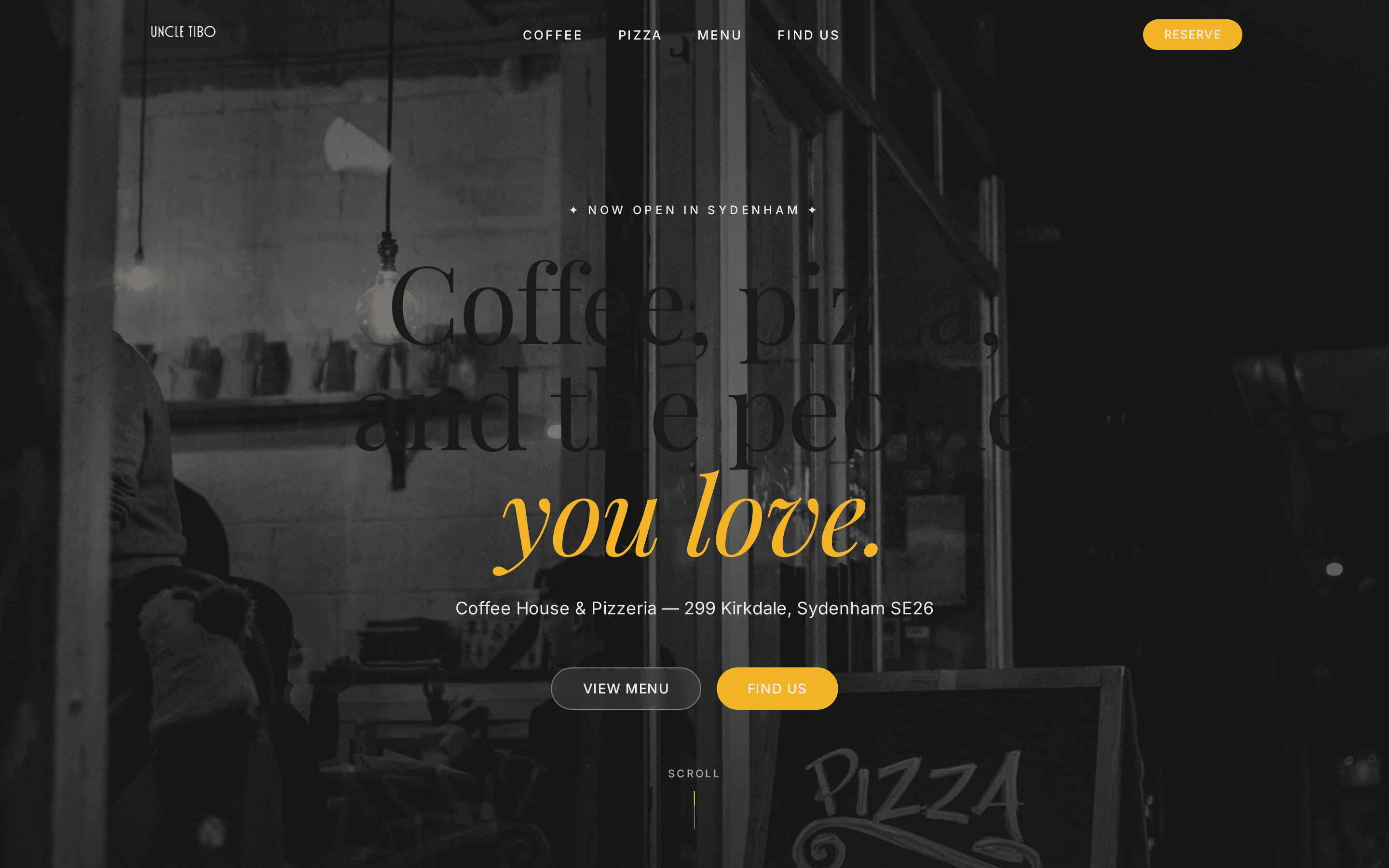
299 Kirkdale, Sydenham. A new neighbourhood spot opening as both a morning coffee house and an evening wood-fired pizzeria — two halves of one room, one brand.
The brief from the owners was small and real: a single-page site that looks like them, not a template. Warm. Community-first. Ember-red accent that nods to the wood-fire without leaning on the red-gingham Italian-restaurant cliché.
"Coffee, pizza, and the people you love."
Constraints
- Launch-day budget — zero ongoing SaaS fees, static hosting only.
- One location, two services — the site has to switch registers (coffee by day, pizza by night) without feeling like two sites.
- Mobile-first — most Sydenham locals will hit the site on a phone.
- Local SEO from day one — "coffee Sydenham", "pizza SE26" — uncontested terms worth claiming.
Research before pixels
The same report pack I run on every build:
- Brand extraction — palette (warm white, cream, ember red
#C84B31, charcoal), Playfair Display for headings, Inter for body. Tone pulled from the owners' previous projects: tricolon phrases, "big love" sign-offs, people-first language. - Competitor analysis — benchmarked 10 London coffee-and-pizza sites. Pizza Pilgrims and Yard Sale at the top; most SE26 independents sit under 4/10. The gap is the opportunity.
- Niche & SEO report — mapped Sydenham-specific search terms with low competition and high local intent.
- Build brief — locked single-page architecture, section order, CTA strategy, photography direction.
- Quality audit — accessibility, performance and SEO baseline before launch.
What shipped
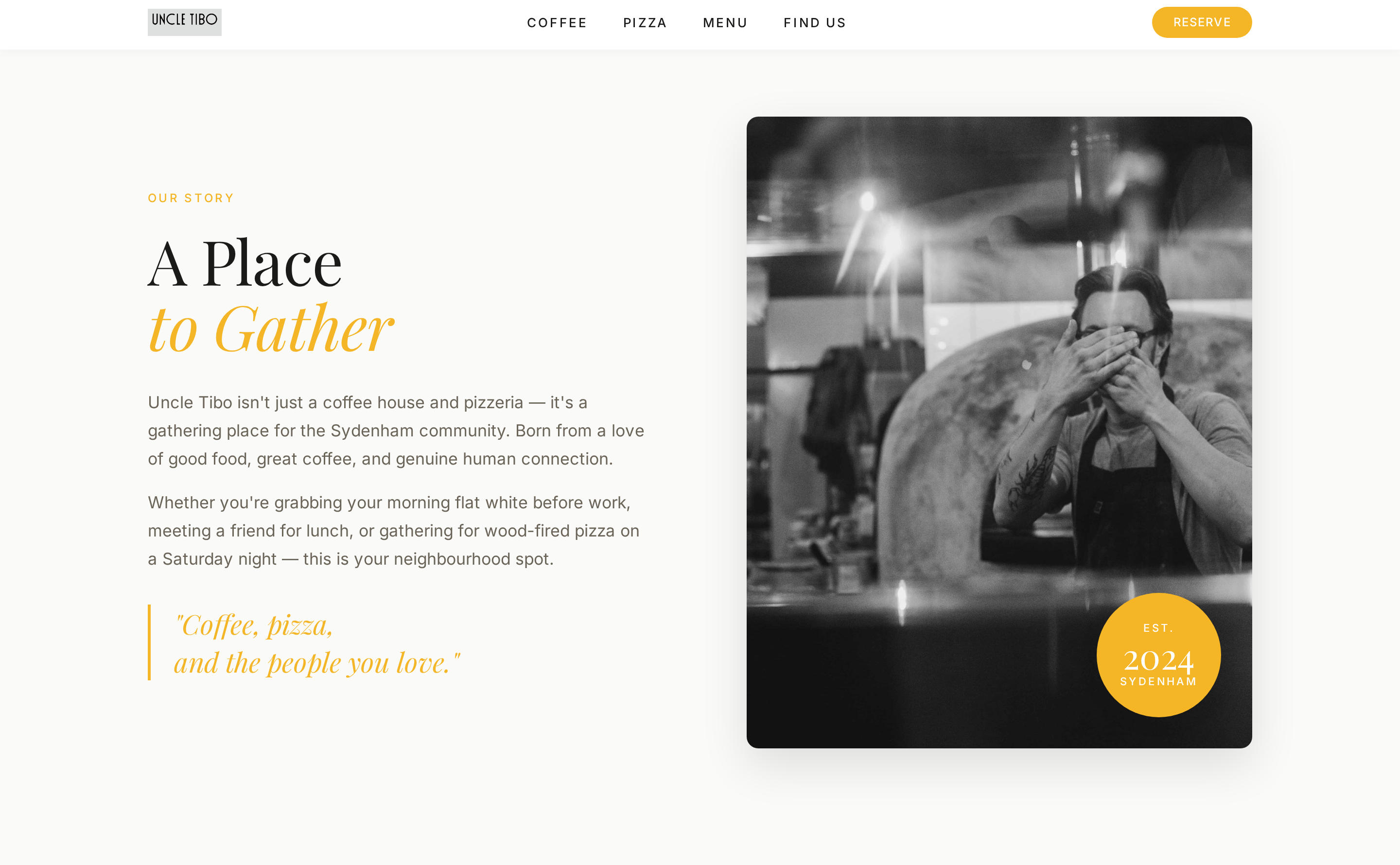
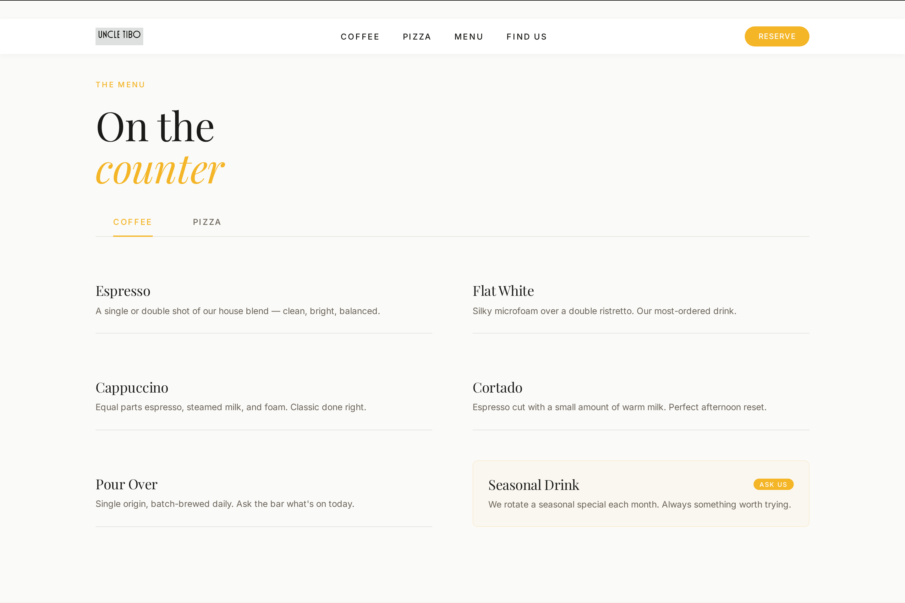
Single-page site: Hero → Tagline marquee → About → Coffee → Pizza → Hours & Location → Gallery → Community → Newsletter → Footer. Ten sections reading as one long scroll.
Three opinionated decisions
- Vanilla HTML / CSS / JS. No framework, no build step, no bundler — just hand-written markup with GSAP and ScrollTrigger for motion. Deploys as static files to Netlify; annual run-cost is the domain.
- Playfair Display paired with Inter. Serif for the editorial moments (hero, section headers), Inter for everything else. Two fonts. Hard limit.
- Ember red as the only accent.
#C84B31, used sparingly — CTAs, marquee stroke, hover states. Everything else is warm white, cream and charcoal. The colour does the work of the wood-fire without needing to show the oven in every photo.
uncle-tibo@main:~$ tree --essentials
├── index.html          # single-page markup
├── colors_and_type.css # brand tokens
├── styles.css          # layout + components
├── assets/             # logo, favicon, og-image
├── 404.html            # branded not-found page
├── robots.txt
└── sitemap.xml
What shaped the build
- The section order is the conversion strategy. Hero hooks with place, tagline marquee stamps the brand, About tells the story, then coffee and pizza split by time-of-day, then the practical info (hours, location) once you're already interested.
- Motion is restrained. Hero text fades up, sections reveal on scroll, marquee ticks along — nothing loud.
prefers-reduced-motionrespected throughout. - FoodEstablishment schema in
<head>for local SEO — address, hours and cuisine machine-readable from day one.
Handover
Site shipped to uncletibo.com with a coming-soon page live for pre-launch, and the full site flipping in on opening day.
Accessibility baseline (WCAG AA colour contrast, keyboard-reachable interactive elements, prefers-reduced-motion), SEO baseline (semantic headings, alt text, schema, sitemap, Open Graph), performance baseline (lazy-loaded images, deferred scripts, no layout shift).
What's next
- Newsletter form wiring once the owners pick an email provider.
- Seasonal menu refreshes — the site is set up so the coffee and pizza section copy rotates without touching markup.
- Google Business Profile claim and Instagram cross-linking for the local SEO stack.