Leo Catering
Leo began as a plant-led cafe in Sydenham and grew into an events caterer. The site had to carry the warmth of the food, read as appetite-first rather than corporate, and turn a curious visitor into a clear enquiry with a date and a guest count.
The setting
Leo started life as a cafe in Sydenham in 2021 — a small place for families, creatives and remote workers. People kept asking the founder, Jack, to cook for their dinners, weddings and office lunches. The catering arm grew out of that, and it needed a home of its own.
The brief was about feel before features. Plant-led food, but never preachy. A site that looks like somewhere you'd actually want to eat, and that makes getting a quote feel like a quick message rather than a form to dread.
"Same food, same hands, in your space."
Constraints
- Appetite first — the photography and tone had to do the selling, not a feature list.
- Plant-led, not preachy — vegan and vegetarian throughout, framed as food people eat without noticing.
- One clear action — every section should funnel toward a single enquiry, not scatter attention.
- Fast and cheap to run — static hosting on Vercel, no ongoing platform fees.
What the site needed to do
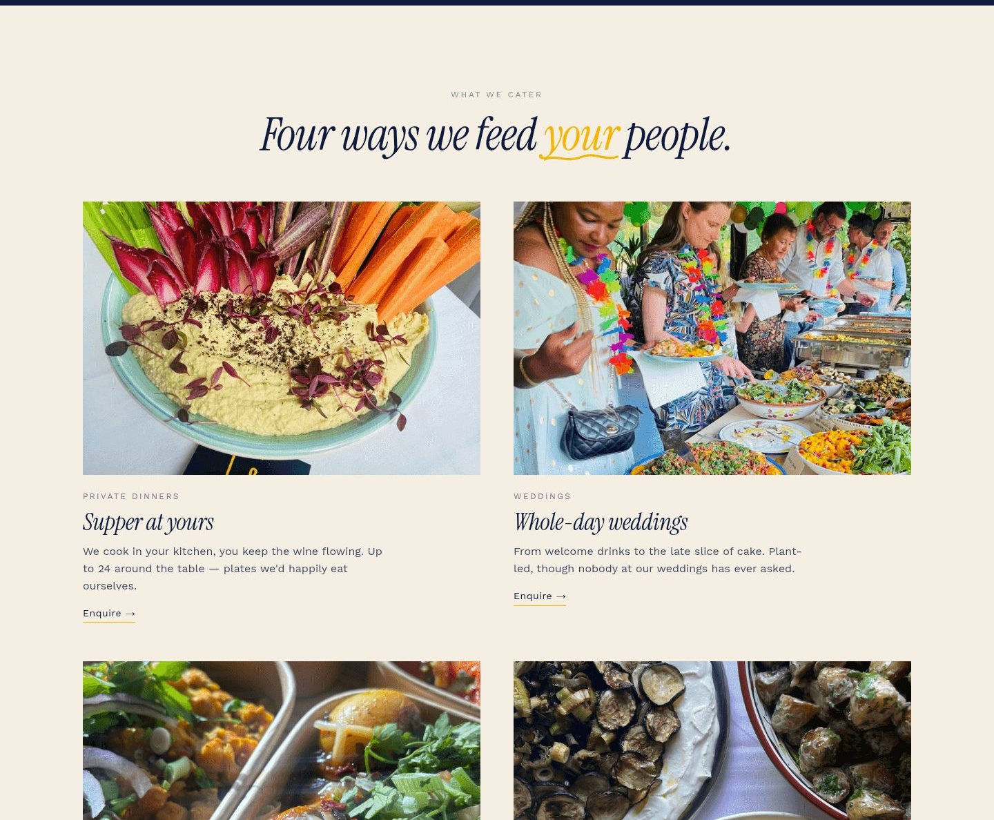
Four ways of working, one personality. The hardest part was holding private dinners, whole-day weddings, office lunches and wakes under a single voice without the page turning into a menu of services.
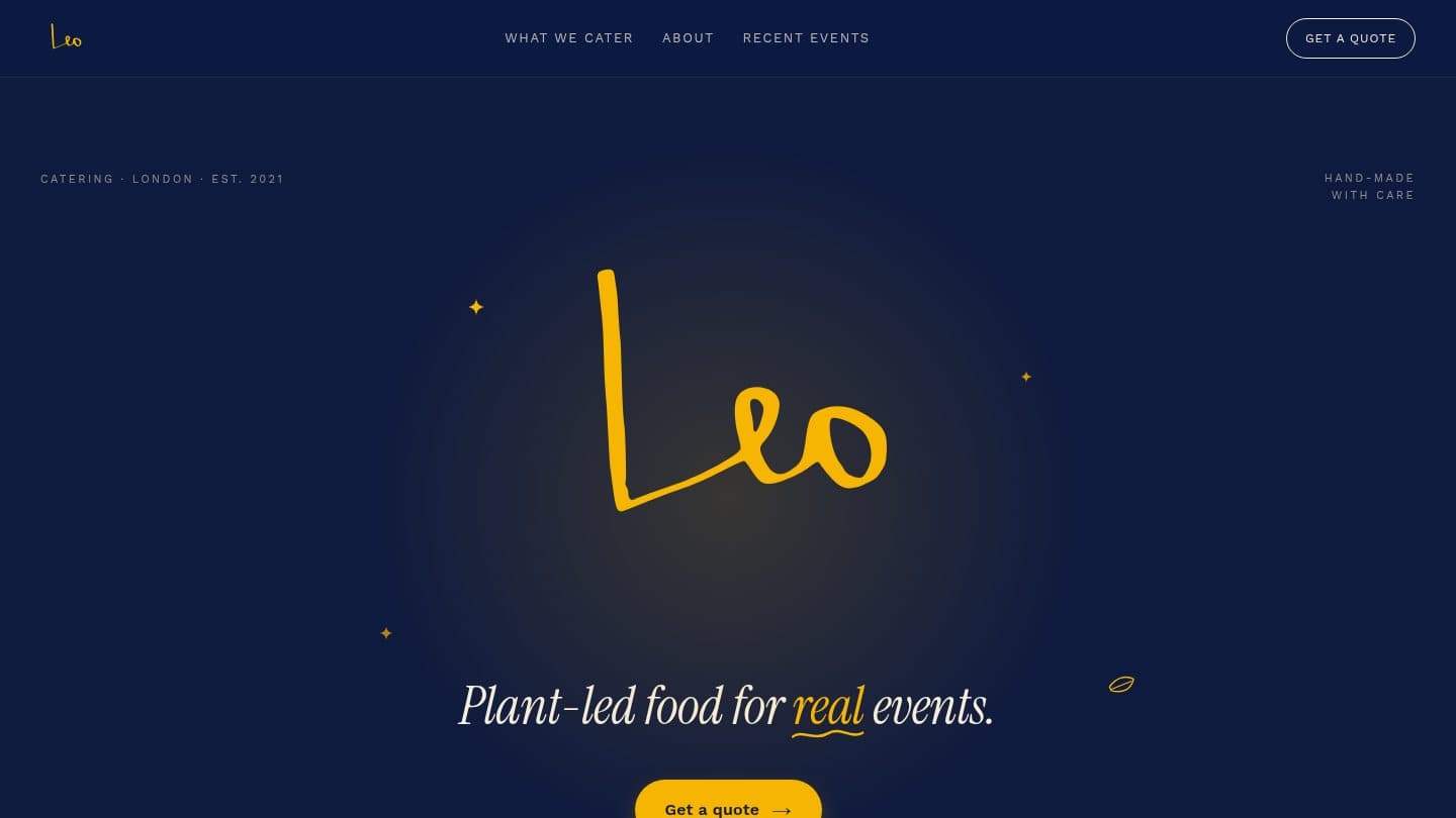
- A hero that sets the tone — deep navy, a hand-drawn Leo wordmark, and one line: plant-led food for real events.
- Four service cards — supper at yours, whole-day weddings, lunch for the team, and the quiet "when it has to be right" for wakes and gatherings.
- A founder section — Jack in his own words, so the brand reads as a person rather than a logo.
- Recent events — a rolling set of real plates with date and place, as proof rather than stock.
What shipped
A single-page scroll: Hero → What we cater → About Jack → Recent events → Sourcing & values → Enquiry → Footer. One read, top to bottom, with the quote form waiting at the end.
Three opinionated decisions
- Navy and gold, not green. The obvious move for plant-led food is leaves and sage. Leo goes the other way — a confident dark navy with a warm gold accent — so it reads as a proper supper, not a health-food brand.
- Photography carries the weight. Real plates from real events, shot close. The copy stays short and lets the food talk.
- One enquiry, framed gently. The form asks for a date, a rough guest count and the kind of event, then promises a menu sketch and a price within two working days. Low effort in, clear next step out.
Handover
Live at leo-catering.vercel.app, deployed as static files on Vercel so the running cost is effectively the domain. The enquiry form routes straight to Leo's inbox, and the events section is structured so new plates can be added as they come in.
Accessibility and performance baselines in place: semantic headings, alt text on every plate, keyboard-reachable navigation and form, and lazy-loaded imagery so the long scroll stays quick on a phone.
What's next
- Wire the enquiry form to a managed inbox or CRM once volume picks up.
- A lightweight way for Jack to drop new event photos in without touching markup.
- Seasonal menu notes, since the kitchen changes the food when the season does.